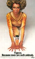
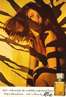
I admit it. At least half the reason I love Fabergé Tigress is its packaging. Although Tigress’s boxes and bottles evolved with time, most of them featured tiger stripe somewhere. My favorite packaging has tiger stripe inside the box, and the stripes are edged in gold against an orange-brown background so rich it’s almost red. The Norma Desmond in me aches for a dressing room papered in it. Faux tiger fur wraps Tigress’s wooden cap — the perfect complement to its topaz-tinted juice. And the fonts! Over the years, Fabergé ran the gamut of glamorous lettering for Tigress. I like the curly font that looks like it should be advertising poodle trims.
Fabergé released it in 1938, but in my mind Tigress isn’t late 1930s or even Norma Desmond’s long lost 1920s. It’s forever 1970s, when Fabergé ruled the drugstore shelves with Brut, Babe, and a line of earth-toned nail polishes my mother loved. Tigress’s palette blended well with harvest gold appliances, too. When I imagine a woman with a long, sandy shag and bell bottomed pants emerging from a Gran Torino, she’s wearing Tigress…